Heatmaps
Analyze user interactions through heatmaps.
Overview of the Heatmaps Feature
The Heatmaps feature provides a visual representation of user interactions on your site. It helps you understand where users are clicking, scrolling, and hovering the most, offering insights to optimize your site’s design and usability.
Filters and Options
Type of Map Filter
-
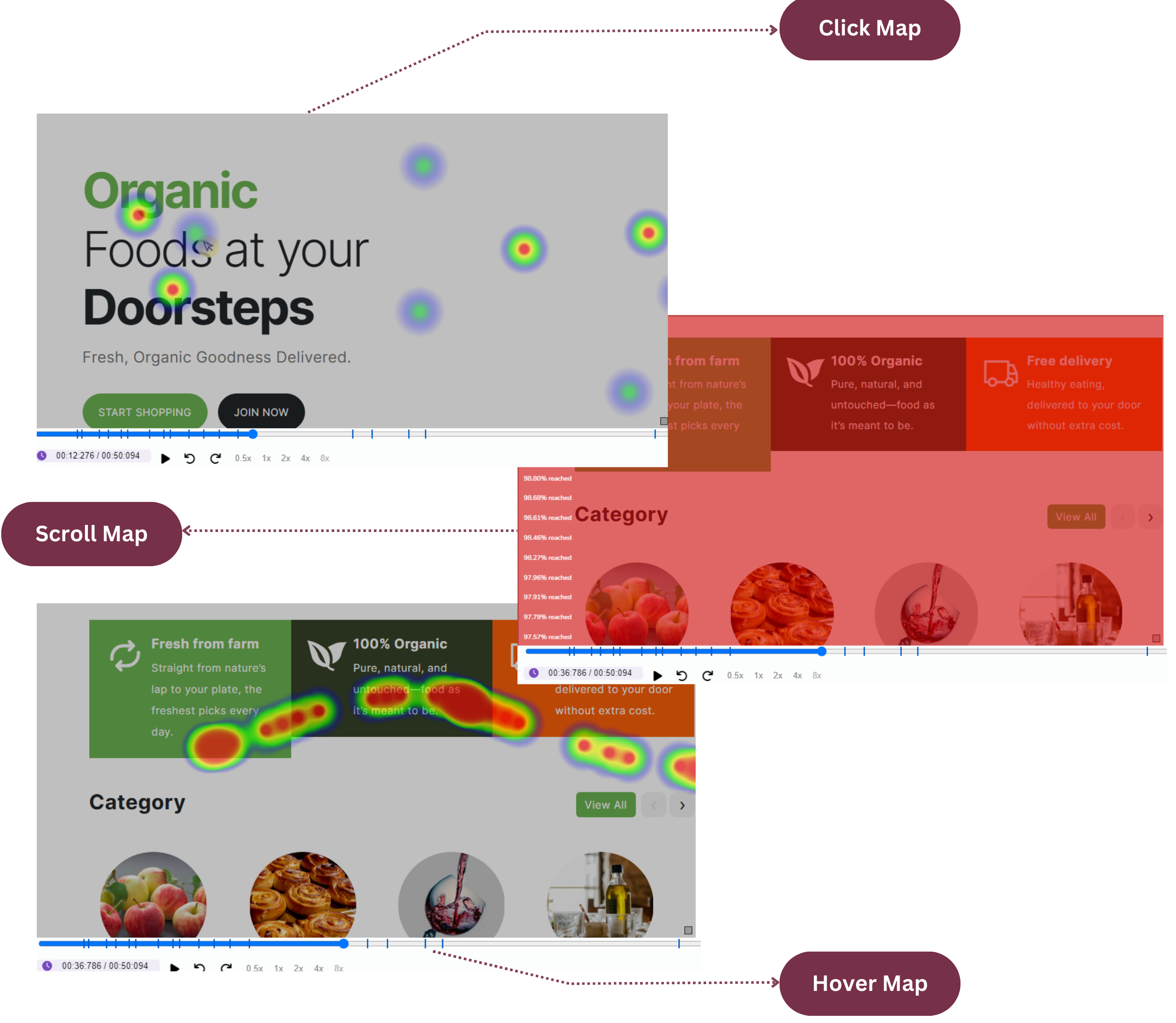
Click Maps:
Highlights areas where users are most frequently clicking. This data helps you:
- Understand user intent by identifying the most interacted elements on your page.
- Discover if users are clicking on non-clickable elements, indicating possible confusion in the UI.
- Optimize CTA (Call to Action) placement for better engagement.
-
Scroll Maps:
Displays how far users scroll down a page, helping you determine:
- Which sections of the page are most visible and engaging to users.
- If users are dropping off before reaching critical content or CTAs.
- Whether important information is placed too far down the page, requiring a reposition.
-
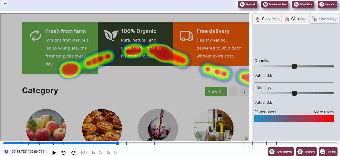
Hover Maps:
Displays areas where users are hovering their mouse, offering insights into:
- Which elements attract attention, even if not clicked.
- Determining potential usability issues by identifying if users hesitate or explore certain areas.
- Enhancing content visibility by relocating or redesigning areas that draw significant hover activity.
Page Selection Filter
The Page Selection Filter is your starting point for creating targeted heatmaps that reveal user interactions on specific parts of your site. This tool allows you to choose the exact page you want to analyze from a dropdown menu, making it easy to focus on individual user journeys. Whether it’s your homepage, a product page, or a checkout flow, selecting a page ensures you gather actionable insights relevant to that context.
For example, if you want to improve your product listing page’s engagement, selecting it through the Page Selection Filter will display a heatmap that highlights areas where users interact the most. This makes it easier to identify sections that grab attention versus areas that may need optimization. With this filter, you can systematically analyze different pages without sifting through irrelevant data.
This feature is especially beneficial for marketers and UX designers who are running A/B tests or launching campaigns. By comparing heatmaps of different versions of a page, you can measure the impact of your changes and optimize user experiences efficiently.
Visualizing User Activity
Heatmap Display: Heatmaps are powerful visual tools that provide a clear representation of how users interact with your website. They aggregate interaction data from all users and visually highlight areas of high, medium, and low activity. High-activity regions, often shown in warm colors like red and orange, indicate where users click, scroll, or hover most frequently. Cooler colors like blue and green represent areas with less interaction, helping you identify neglected or underperforming sections.
For instance, if a call-to-action button on your page is in a less active (cool) zone, it may suggest that users are not noticing it, prompting you to consider repositioning or redesigning it for better visibility. Similarly, if a non-interactive element shows excessive activity, users may be confused, thinking it’s clickable. Such insights empower you to make targeted changes that directly impact usability and conversions.
By providing an intuitive, color-coded view of user activity, heatmaps help teams quickly understand user behavior patterns. This feature is particularly useful for designers, developers, and product managers working collaboratively to enhance the user experience.
Customization Options
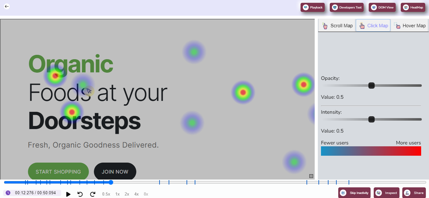
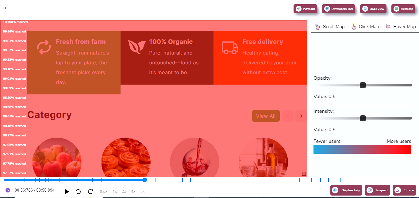
Intensity Control
The Intensity Control slider lets you customize how prominently user interactions are displayed on the heatmap. By increasing the intensity, you can make areas with high activity stand out more vividly, enabling you to focus on the most significant parts of the user experience. Conversely, reducing the intensity provides a more balanced view, making it easier to spot trends across the entire page.
For instance, if your heatmap is cluttered with overlapping colors, lowering the intensity can help you view interaction zones without overwhelming details. This feature is especially useful when analyzing pages with dense content or numerous interactive elements. It ensures that no area of interest is missed, even in complex layouts.
Use the intensity setting to prioritize areas that align with your goals. Whether it’s increasing visibility for a specific call-to-action or understanding why certain sections receive low engagement, the flexibility offered by this slider ensures tailored insights.
Opacity Control
The Opacity Control slider allows you to adjust the transparency of the heatmap overlay. By fine-tuning the opacity, you can clearly see the underlying elements of your page while still visualizing interaction data. This feature is particularly useful for aligning heatmap data with page design, ensuring that no key detail is obscured during analysis.
For example, if you’re analyzing how users interact with a specific form, reducing opacity can help you view the form fields clearly while still observing user behavior. This level of customization allows you to maintain context, ensuring that your analysis is both accurate and actionable.
Combined with intensity control, opacity adjustments provide unparalleled flexibility in heatmap analysis. Whether you’re a designer reviewing layouts or a developer troubleshooting interactive elements, these controls offer the precision you need for effective decision-making.
How to Use the Heatmaps Page
Selecting a Map Type
The Heatmaps Page allows you to choose between three distinct map types—Click Maps, Scroll Maps, and Hover Maps—depending on your specific analysis needs. Each map type offers unique insights. For instance, Click Maps focus on tracking where users click, providing actionable data on the usability of buttons and links. Scroll Maps, on the other hand, show how far users scroll down the page, helping you gauge content visibility. Hover Maps reveal areas where users linger their cursor, offering insights into which sections capture attention without requiring clicks.
To get started, simply use the Type of Map filter at the top of the Heatmaps Page. Choose the map that aligns with your goals. For example, if you’re optimizing a blog post, a Scroll Map can help you determine whether users are reading to the end. Alternatively, for improving navigation, Click Maps can highlight which menu items receive the most attention.
Switching between map types is seamless, allowing you to compare data and build a comprehensive understanding of user behavior. This versatility ensures that teams can adapt their analysis to suit diverse projects.
Choosing a Page to Analyze
Once you’ve selected a map type, the next step is to choose a specific page using the Page Selection filter. This feature allows you to focus on individual pages, ensuring that the insights you gather are relevant and actionable. For example, you can analyze your product page separately from your homepage to identify unique user interaction patterns on each.
Selecting a page to analyze also makes it easier to align your heatmap findings with broader business goals. For instance, eCommerce teams can use heatmaps to evaluate how users interact with product images or add-to-cart buttons, while content creators can focus on blog engagement.
Adjusting Map Settings
Heatmaps offer several customization options to tailor the analysis to your needs. Adjusting settings like intensity and opacity helps you focus on specific details or view the broader picture. This flexibility ensures that the heatmap visualization aligns perfectly with your objectives.
For instance, if your goal is to pinpoint high-priority action zones, increasing the intensity can make these areas stand out more clearly. On the other hand, if you’re reviewing how interactions span across the entire page, a balanced intensity with lower opacity may be more appropriate.
Insights from Heatmaps
Click Maps
Click Maps provide insights into how users engage with specific elements on your page, such as buttons, links, or images. These maps help you identify which parts of your site attract attention and which are overlooked. For example, if a primary call-to-action button receives few clicks, it may indicate the need for better positioning, design, or copy.
By analyzing click patterns, you can also uncover usability issues. If users frequently click on non-interactive elements, it suggests confusion in the interface design. Resolving such issues can enhance user experience and boost conversions.
Scroll Maps
Scroll Maps reveal how far users scroll down a page, helping you assess whether important content is visible and engaging. For example, if users consistently drop off before reaching a critical section, such as pricing information, it may signal that the content higher up is too lengthy or unengaging.
These maps are particularly useful for content-heavy pages like blogs or landing pages, where user retention throughout the page is critical. Use Scroll Maps to restructure content or place key information in more visible areas.
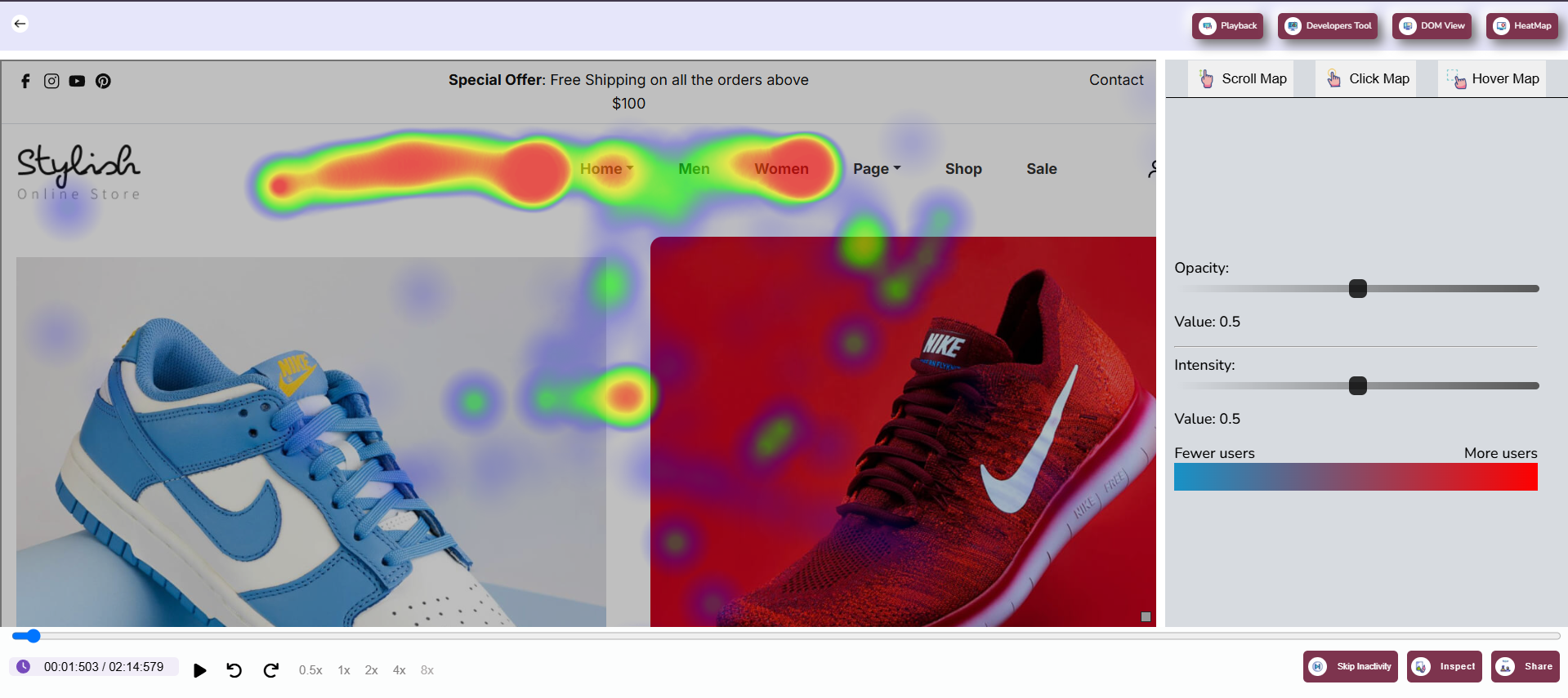
Hover Maps
Hover Maps track where users linger their cursor on the screen, offering insights into which areas capture attention even if they aren’t clicked. For instance, hovering over images or specific text might indicate interest, which you can leverage to optimize content or add interactive elements.
These maps are an excellent tool for understanding implicit user behavior, especially on pages where users consume information rather than perform actions. By analyzing hover data, you can refine layouts to better align with user expectations.